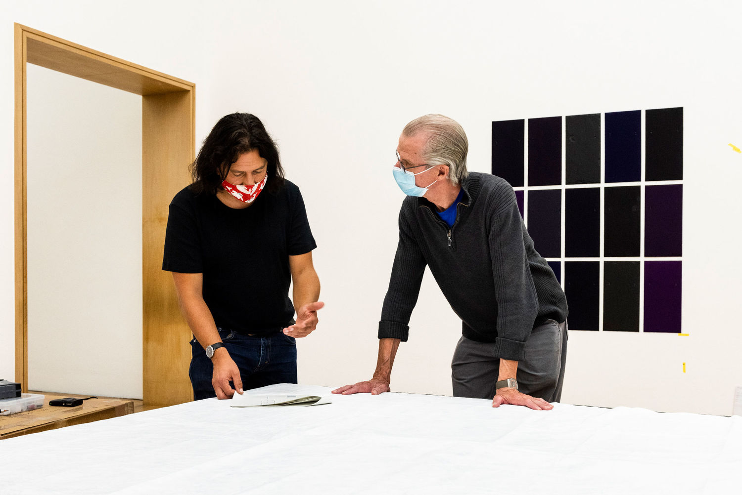
The artist Winston Roeth in the exhibition "Speed of Light". Photo: Museum Wiesbaden / Christoph Boeckheler
In this contribution, curator Dr. Jörg Daur and artist Winston Roeth enter into a direct dialogue. They talk about the meaning of color, the visual rhythm and the inner order in his paintings or the potential of raw pigments to become light.
JD: Winston, when looking at your paintings it quickly becomes apparent that it’s a question of color. What do you think or “feel” about color?
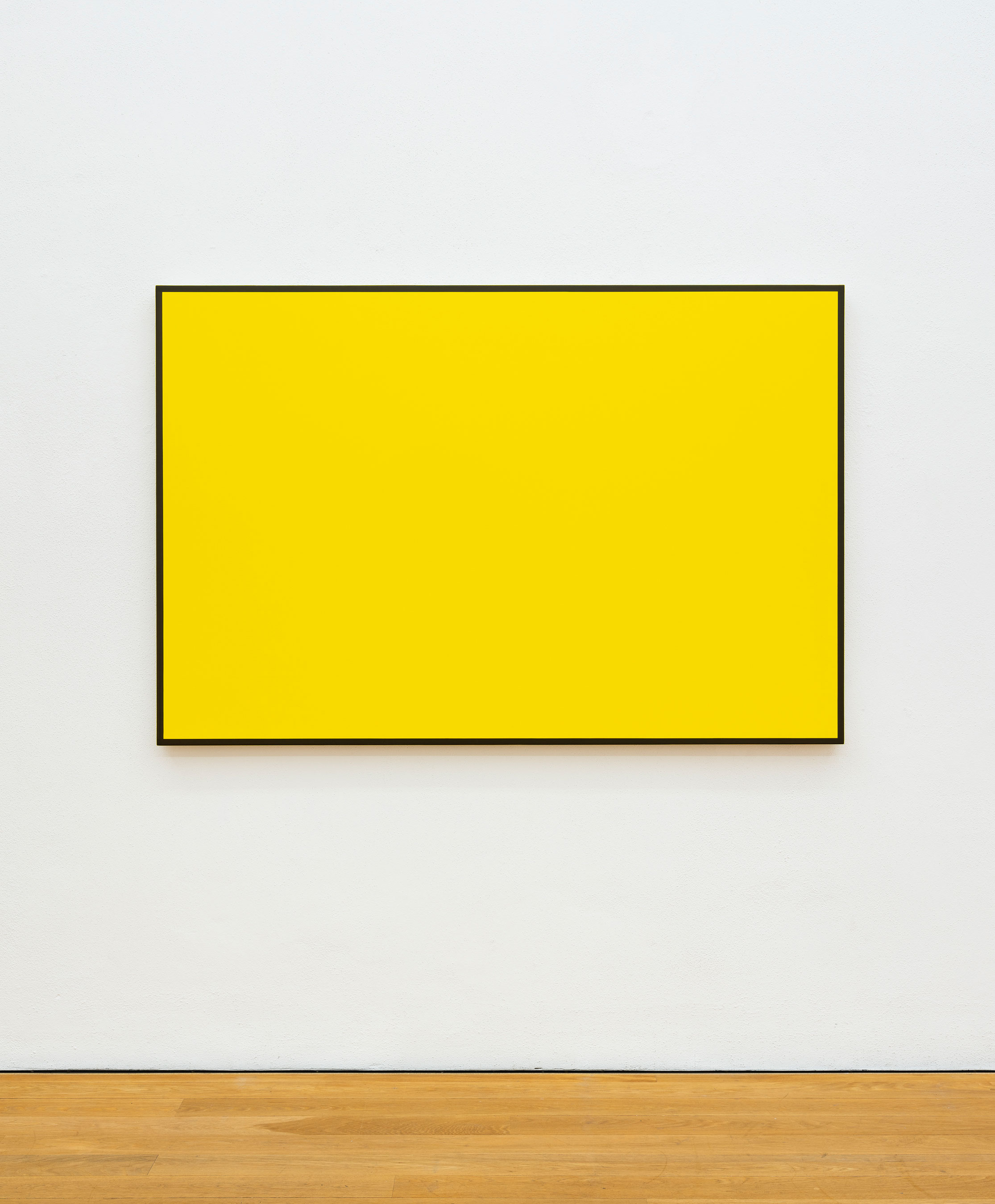
WR: I’m not interested in arranging colors to decide which ones go together. If a color is honest and clear, it can hang with any other color that has clarity. Active color, wet color and dry color, indeterminate color that shifts with the movement of the viewer or the angle of sunlight, color that can hold light or shadow on the same surface, color that is transformative. Energy.
JD: You work with raw pigment. What does this engender in your paintings?
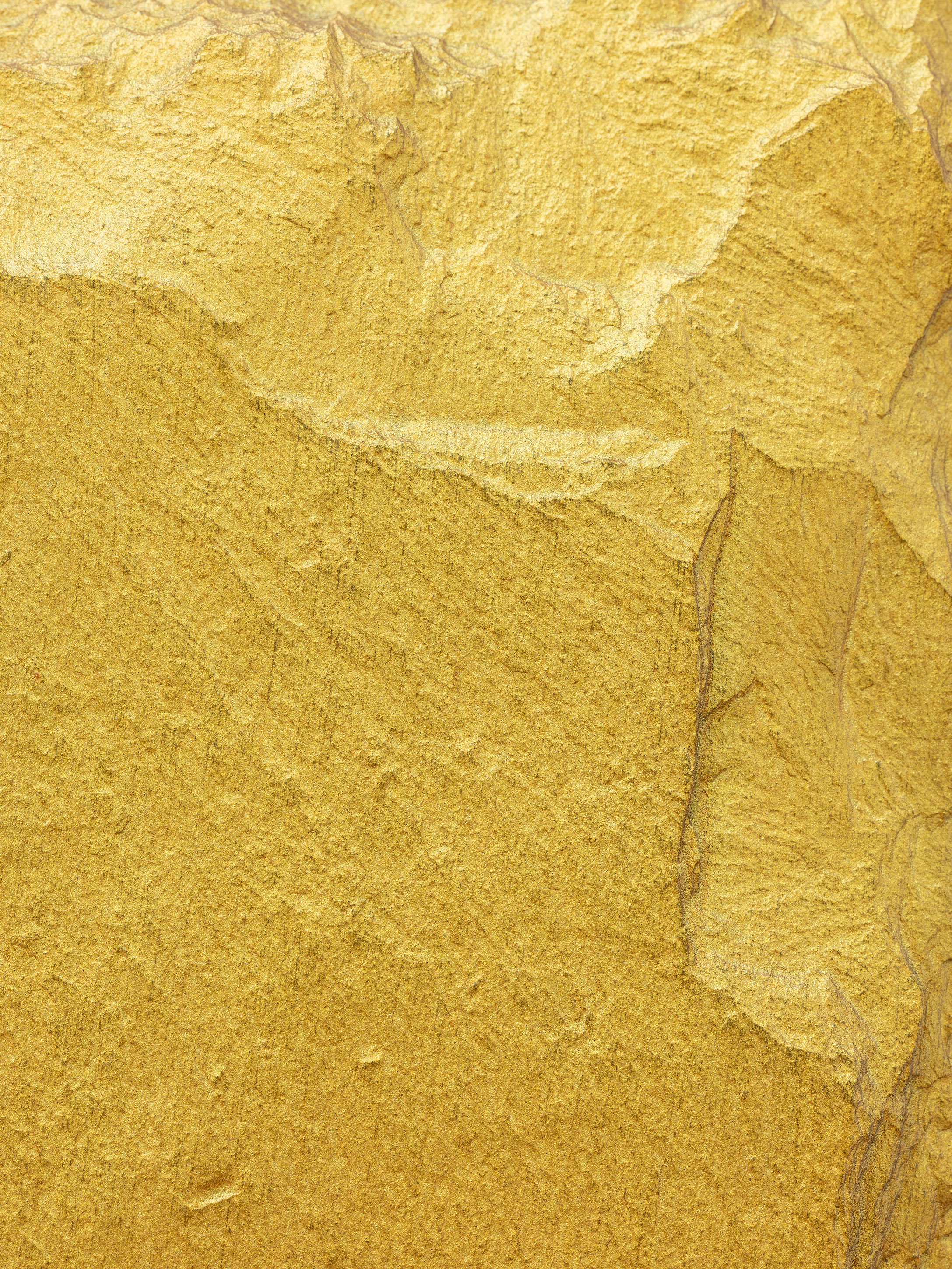
WR: In 1974, an Italian conservator friend, Piero Mannoni, introduced me to the color of raw pigments, and I began experimenting. Over the years, my experience using pigments grew. Pigments held within them a complex knowledge and history. Their material color had the potential to become light, which has the energy of illumination. Light that could jump out and grab the viewer, or chroma that can pulse with a deep glow. These traits are not illusions, they’re real. This is the energy of color when it becomes light.
JD: You stress that the color of the pigments, hence the “light” of the pigments, is real and not an illusion. That makes sense, because color is not a depiction of something else but is just color itself. However, besides that there is also some kind of illusion in what you see with respect to the (color) space. Especially when you neutralize the surface, eliminate brushstrokes—an illusionary space develops that reaches far beyond the pictorial surface (or into it).
WR: I understand and agree that color as a visual impression becomes an “illusion.” But when I’m painting and a color emerges that is illuminated, that one can feel, it strikes me that the illumination is real and not an illusion. This is the difference between a color that is dead and one that’s alive. There seems to be a difference, at least in my mind, between the illusion and the reality of illumination.
JD: Yet what happens when the structured surfaces (slate or rough cut wood) join with the color space, when the illusion of the three-dimensional space is set back to its factual two-dimensionality?
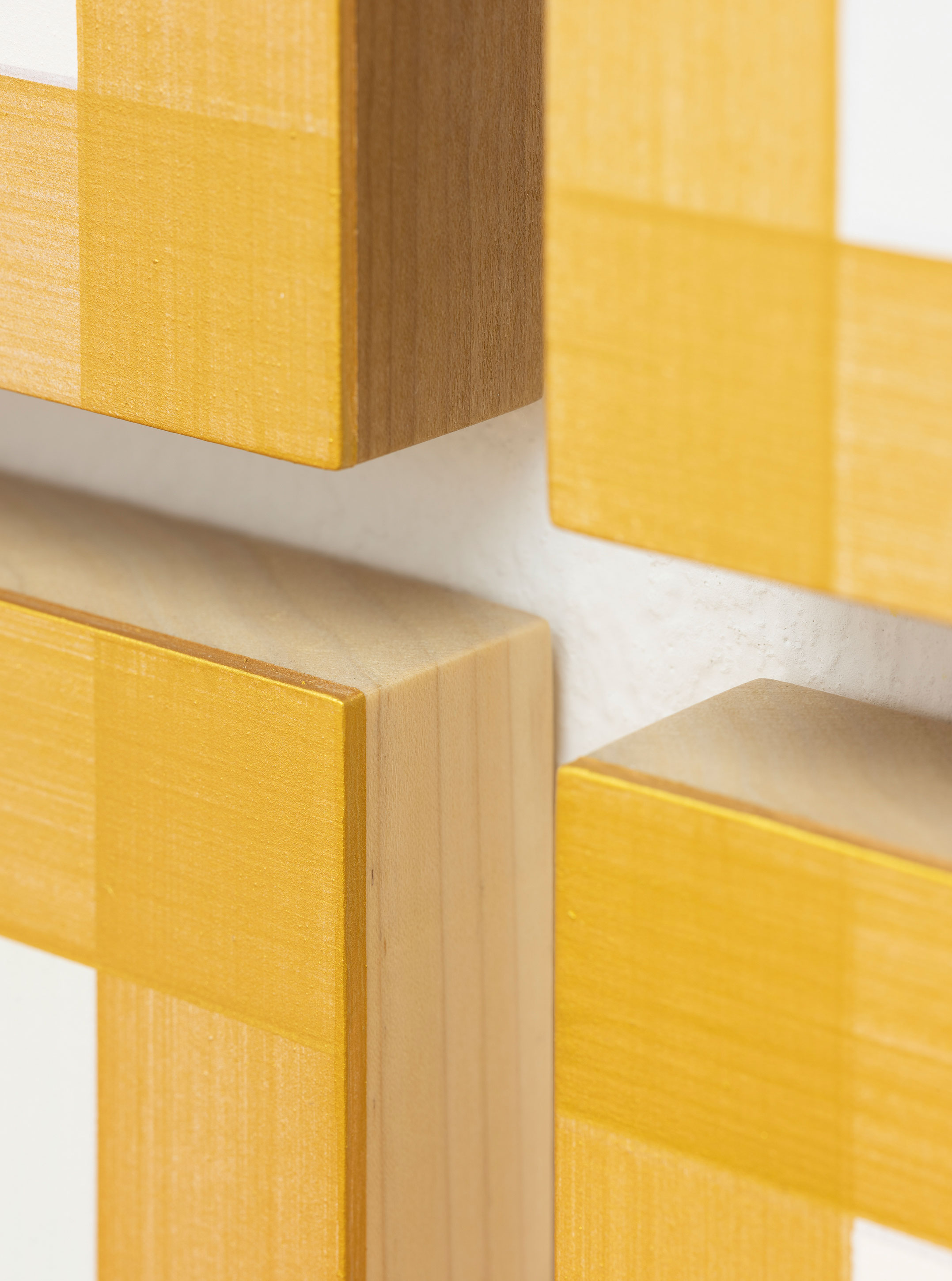
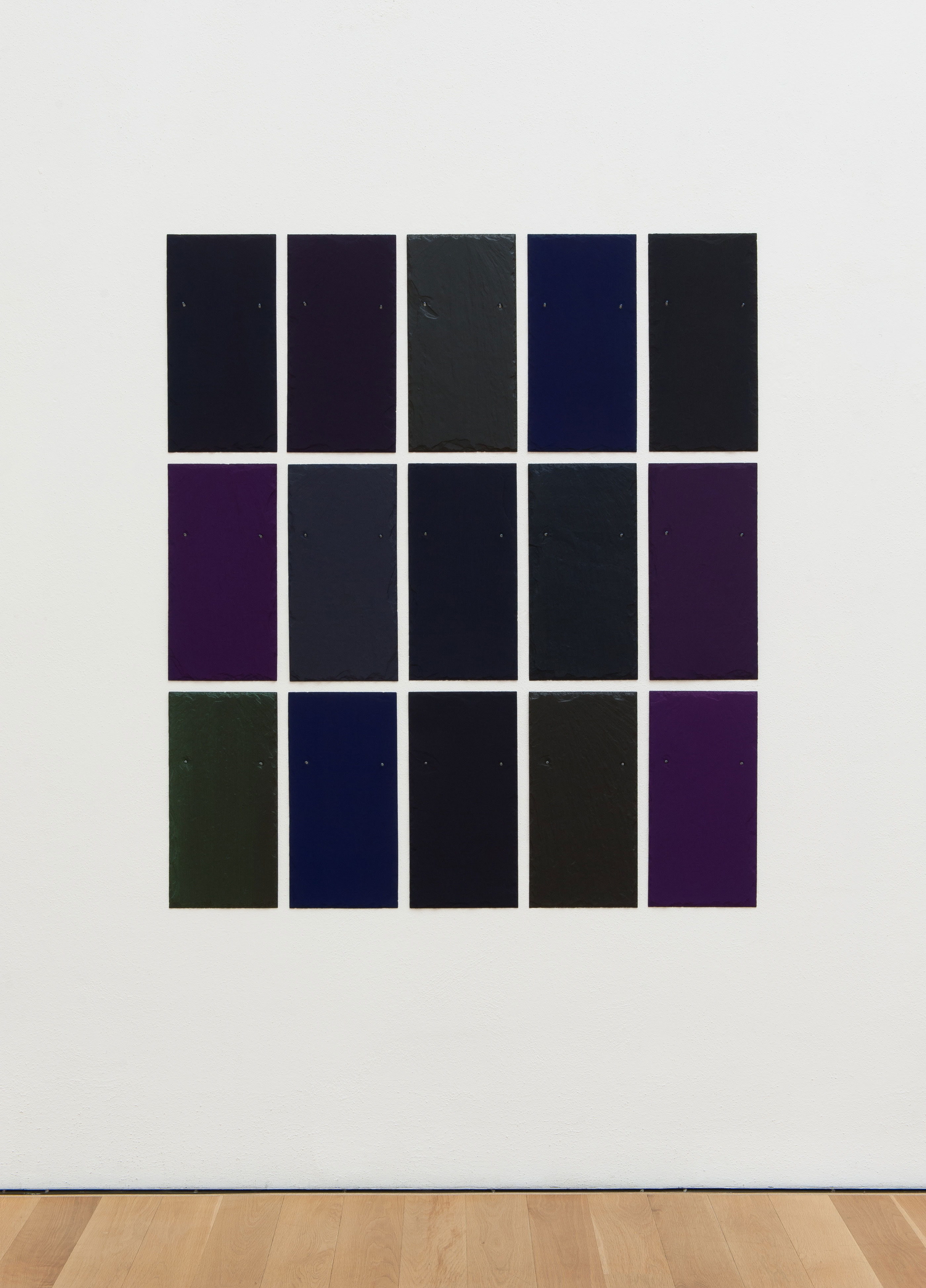
WR: My initial reasons for painting on slate was the structure of the slate’s physical identity. I decided to incorporate identifiable surfaces with raw and rough surfaces among the supports I worked with and use the same paint and mixing I’d been learning for years. It was something different to explore. I liked the physicality.
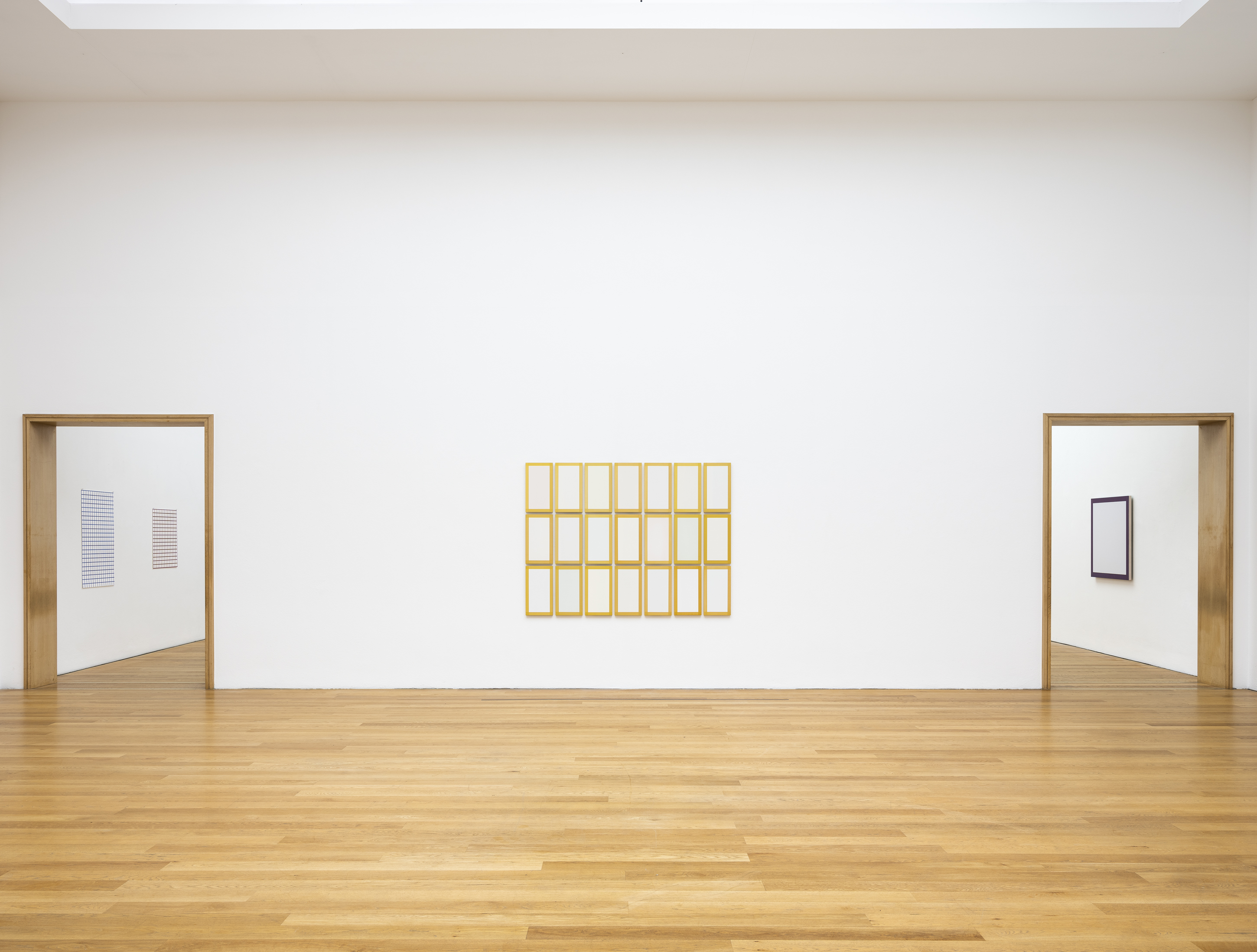
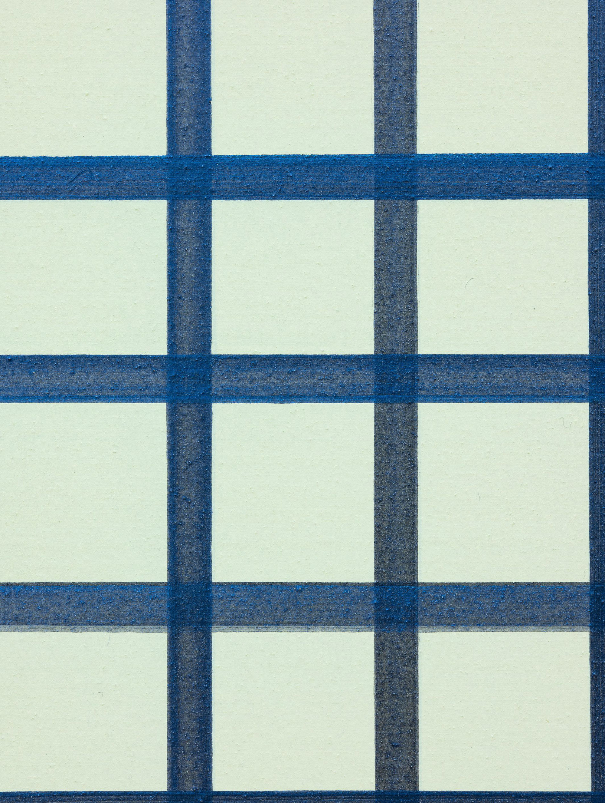
JD: Let’s linger on this “space thing” for a moment. Whenever two colors encounter one another, they create an illusionary space. Such as in the case of your paintings bordered by painted frames.
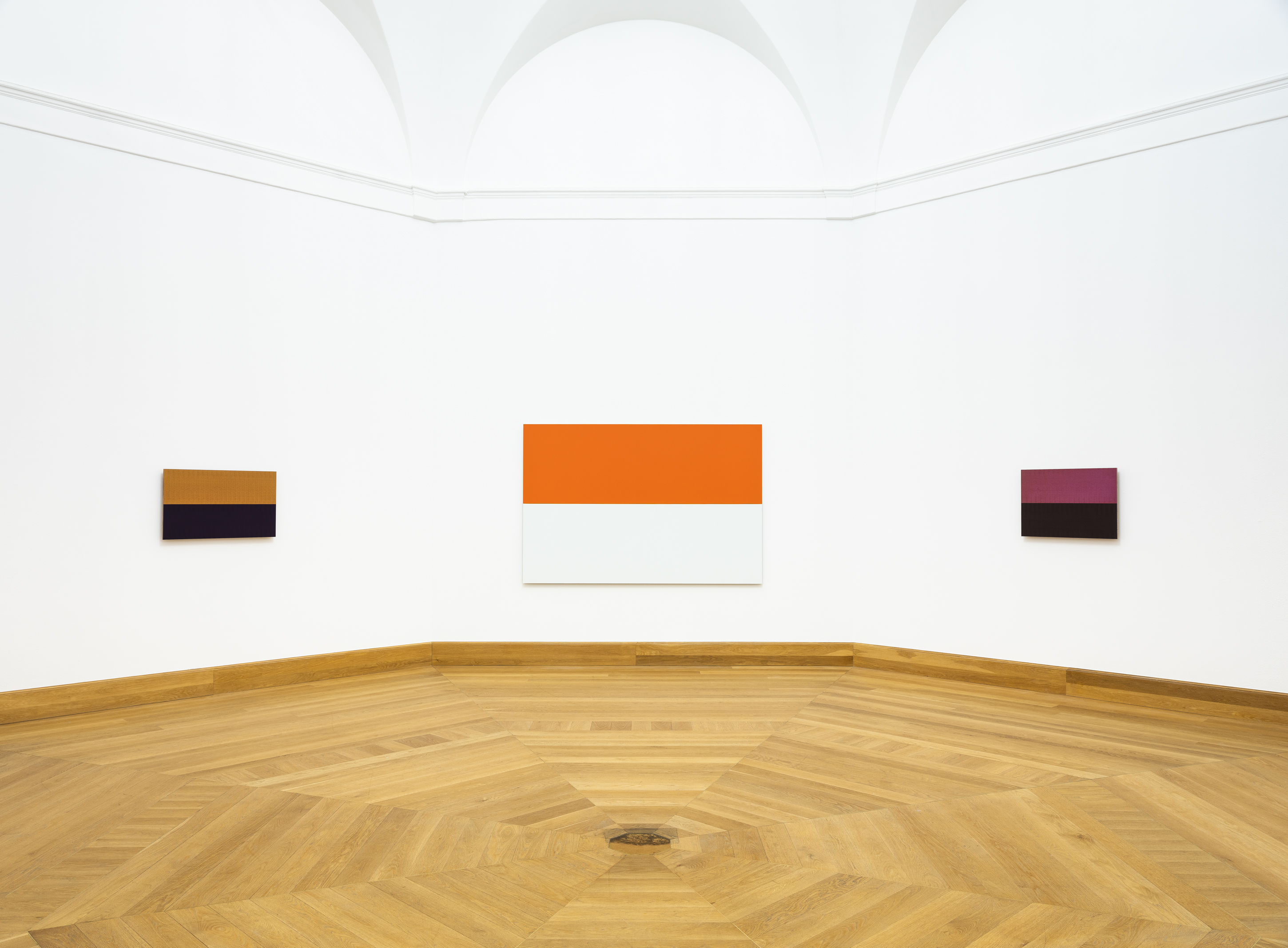
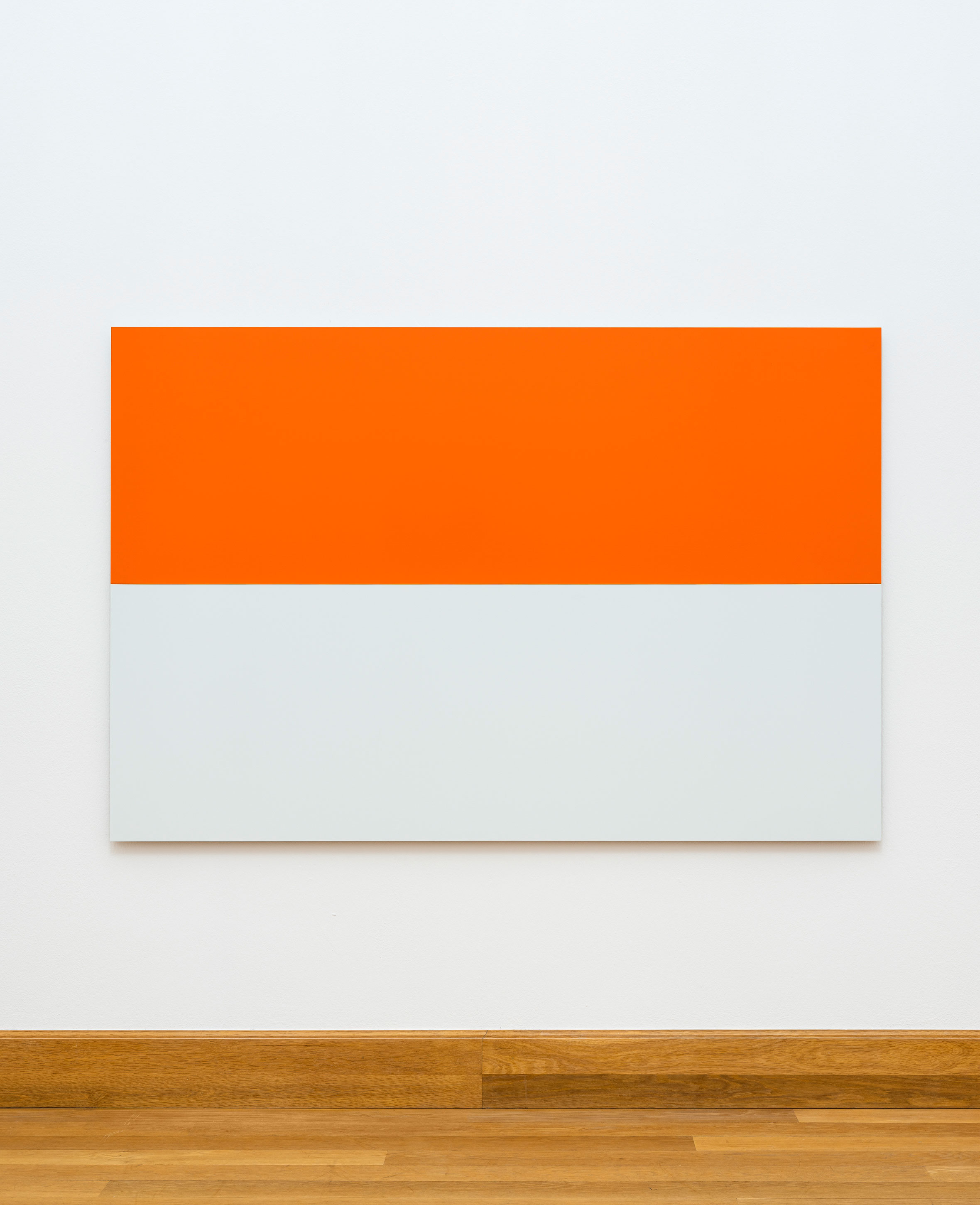
WR: The paintings with borders have been referred to as “space paintings.” Early on I called them “containment” paintings. The border contained the energy of the color and amplified the internal light. It was also a way for me to break free of the single-color monochrome. The borders had a visual speed about them, the speed of light as they surrounded the interior color, which was “dry” and slow. Two rather simple elements with complex visual results. The interior was an indeterminate color, amplified by the border that contained it. Another factor for me was that the border simply followed the form of the painting, be it square or rectangular. The form was defined and the interior resonated when it was contained.
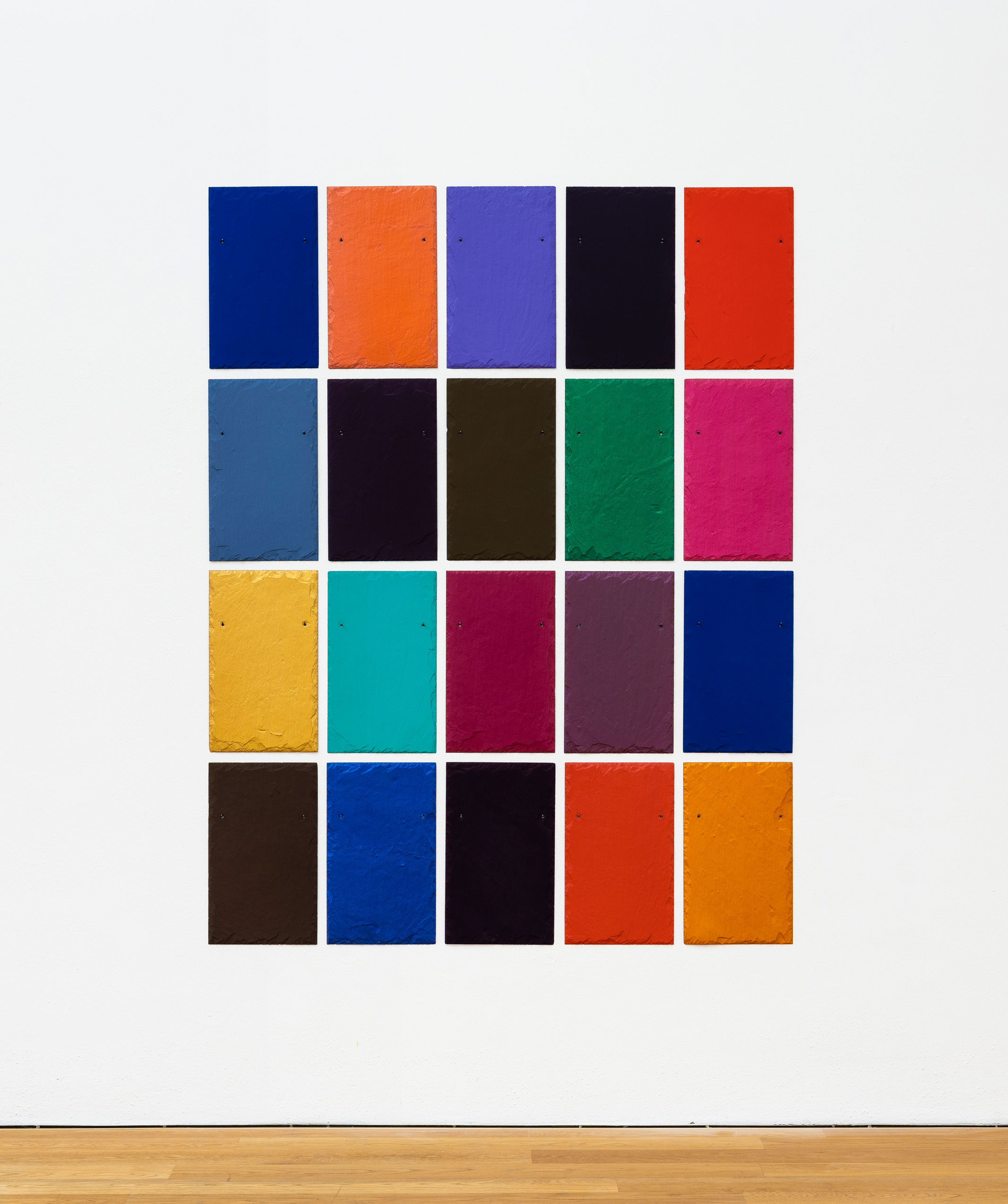
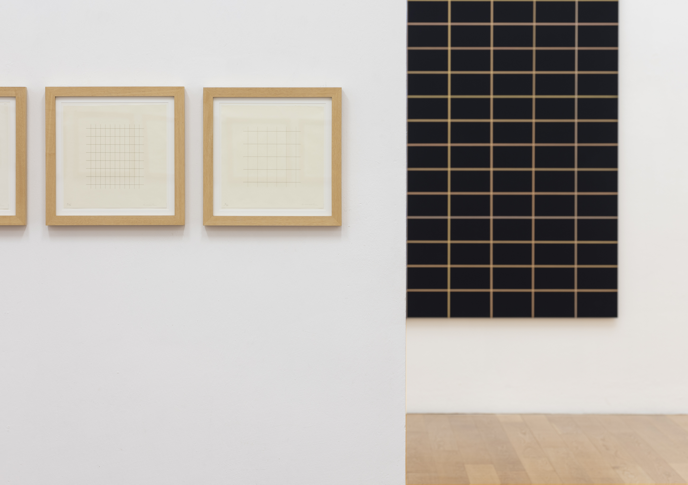
JD: That’s similar to the grid; in addition to this, however, the grid creates an interior order: the lines or panels themselves—not least by means of their different colors—begin to interact. Can you explain this “interaction”?
WR: In the multipaneled paintings there is a definite rhythm between the parts. The rhythm comes about in the process of painting. An accumulation of subtleties that reveal themselves and their differences in the process. Light and dark, dry and wet, reflective and absorptive—these qualities give the different multiples of the painting a distinct visual rhythm. In those multiples that share similar color qualities, the subtleties that are different in each part create the rhythm of the painting. The rhythms change with the light and with the position and movements of the viewer.
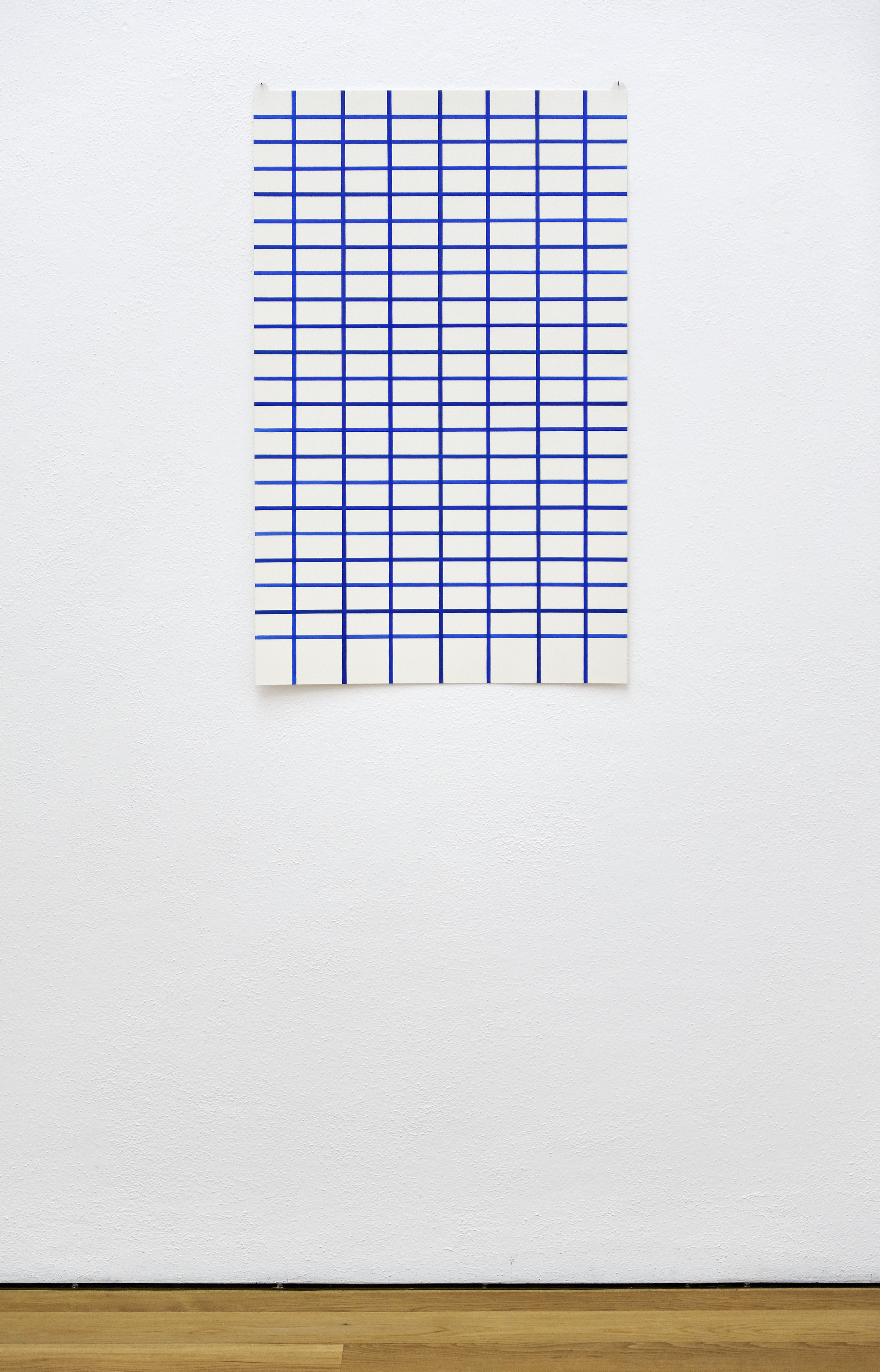
JD: One last question: You told me that you explored drawing at the beginning of the pandemic, when you went up to Maine to isolate yourself. You do not normally draw with pencil or crayon but with paint. What is your experience with the special material of paper?
WR: In early April Susan and I went to our house and studios in Maine. I decided I’d use the time to meet an urge I’d had to get into my drawing. I had a trove of rare handmade papers that I’d collected in the early 1970’s when Alan Uglow and I were working for Petersburg Press, printing etchings for artist editions. Part of our job was building up the stock with a wide variety of handmade papers. There were always leftovers that we were allowed to keep. Many of those papers came with me in April. In my Maine studio I could explore drawing and let time drift by. It felt free. An antidote to COVID-19. Drawings for me are primary elements, not preparations for painting. They stand alone. I love working with paper. It has a mind of its own with endless qualities that can give but also resist. It’s beautiful how the tenderness of drawing can span time and space. The intimacy of paper is a beautiful thing.
By
Dr. Jörg Daur
Deputy Director
Custos of modern and contemporary art
This Interview is part of the exhibition-catalogue
Speed of Light
Jörg Daur, Lea Schäfer
136 p., 80 Ill., dt./en.
30 x 24 cm, Hardcover
Esslingen: Dr. Cantz’sche Verlagsgesellschaft 2020
ISBN: 987-3-89258-133-8
24,— Euro (Museumsshop)